Digital Facsimiles:
Reading the William Blake Archive
Joseph Viscomi
Tyger,
Tyger, burning bright,
In
the forest of the night:
What
immortal hand or eye,
Could
frame thy fearful symmetry?
(1-4)
I.
The Case for Facsimile Reproduction
The
lines of the epigraph are from the most anthologized poem in English
literature. [2] They are, of course,
the first four lines
from William Blake’s “The
Tyger,” one of twenty-six poems in his Songs of Experience, first printed in 1794 with twenty-one
poems and combined at that time with his Songs of Innocence of 1789 to create his best known
illuminated book, Songs of Innocence and of Experience. These bibliographical details, though, only hint at
the complexities of studying and editing Blake’s poetry, complexities
revealed more quickly and clearly by a simple comparison between the lines as
they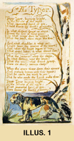 appear above and the form in which they were originally read (illus. 1).
Immediately, we see that Blake’s text is calligraphic, illustrated,
and finished in watercolors, features which textual scholars have argued
theoretically—and,
I believe, we sense intuitively—as contributing to the meaning of the
whole. [3] Indeed, we recognize the typographic translation
as grossly
distorting the original artifact, a hand-colored
impression printed from a copper plate executed in “illuminated printing”
(i.e., “relief etching”), a technique Blake invented in 1788.
Instead of the needles, burins, and other metal tools of the graphic artist,
Blake worked on copper plates with pens, small brushes, and an ink impervious
to acid (probably asphaltum in turpentine mixed with a little lampblack);
he wrote text backward, illustrated it, and etched the untouched metal below
the surface to leave the integrated design in printable relief. Working
on
metal with the tools of poet and painter enabled Blake to create a multi-media
space, a “site” where poetry, painting, and printmaking came
together in ways both original and characteristic of Romanticism’s
fascination with autographic gesture, with spontaneity, intimacy, and organicism.
Blake used illuminated printing as a mode of production rather than
reproduction, combining text and illustration on the plate for the first time
rather than reproducing a pre-existent page design. The etched design, however,
is continually recreated when printed, for it is printed in different inks
and colored differently at different periods. The result is a “printed
manuscript,” an oxymoron coined by Robert Essick to describe Blake’s
ability to produce repeatable yet unique works. 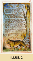 For example, “The Tyger”
above (illus. 1) is from an early copy of Songs designated
as copy “C”; its Experience impressions were printed in 1794 in yellow
ochre ink on both sides of fine wove paper (which when bound with other leaves
created facing pages) and finished in light watercolor washes. This version
looks and feels quite different from the impression in late copy Z
(illus. 2), which was printed in 1826 in orange-red ink
on one side of the leaf, elaborately colored, strengthened in pen and ink,
and given frame lines like a miniature painting.
Now, add to this basic comparison numerous other impressions produced
from the same plate at different times and in different production styles,
each looking slightly to dramatically different from the other, each with
the possibility of textual variants, and nearly all occupying a different
place in each copy of the book, and you will begin to glimpse the bibliographical
and textual difficulties confronting the editor—and student—of
Blake.
How
editors resolve these difficulties affects directly how Blake is known and, of
course, what Blake we come to know. Typographic transcriptions, which abstract
texts from the artifacts in which they are versioned and embodied, made good
economic but poor editorial sense. They made possible inexpensive editions of
Blake’s poetry and his inclusion in anthologies—and thus
classrooms—but, as we see, at the expense of Blake’s intentions.
Such transcriptions are “reader’s texts” when Blake’s
idiosyncratic punctuation is corrected, with stops determined by modern rules
of syntax or grammar. For example,
Keynes edits the lines as:
Tyger! Tyger! burning bright
In the forest of the night,
What immortal hand or eye
Could frame thy fearful symmetry?
(1-4)
Erdman,
on the other hand, attempts to reflect Blake’s markings as closely as
type allows (many of Blake’s marks have no typographic equivalent), choosing
marks by consensus, by comparing numerous printings of the text to see which
mark—e.g. comma or period—is most often present:
Tyger Tyger, burning bright,
In the forest of the night;
What immortal hand or eye,
Could frame thy fearful symmetry?
(1-4) [5]
The
resulting composite text may claim to have excavated the text as executed on
the copper plates, but it no more corresponds to an actual printed work than
the user friendly reader’s text.
Relative to type, unscaled monochromatic reproductions of colored
illuminated pages move readers closer to Blake’s vision, though they
fail to capture size, color, and texture of the original.
At the other end of the reproductive continuum are facsimiles, and
the finest of these, like the hand-colored collotypes produced by the William
Blake Trust between 1952 and 1978, represent the originals more successfully,
but as expensive limited editions they are themselves not readily available
to students. And even they fail to provide the kinds of detail necessary
for good art historical and editorial analyses. To discern, for example,
whether
a mark was etched on the copper or added or changed afterwards in printing
or coloring the impression would still require close first-hand scrutiny
of
the original works, which are housed in international collections at widely
separated locations. Moreover, facsimiles and reproductions both present
an
edited Blake, edited in the sense of works selected for reproduction and
in the way images are reproduced. Indeed, the public’s exposure to
Blake—and
this includes many advanced students and not a few scholars—has been
narrowly restricted to a small number of items that have been too frequently
reproduced. [6] For example, Songs
copy Z (illus. 2) is one of only two copies (both late)
commercially reproduced in color, whereas the less flashy early copy C (illus.
1) has never been reproduced. Reproductions and facsimiles also edit
Blake by reproducing only the image and not the full sheet, which means
bibliographical
information, such as paper’s size and the plate’s registration
to the paper, goes unrecorded and Blake—or Mrs. Blake—appears
to be a neater printer than he/she was and the pages visually more uniform
than they are.
Typographic editions and reproductions of only about 20% of Blake’s
illuminated canon (40 or so of the 175 copies of the 19 illuminated books
Blake produced between 1788 and 1827, when he died), reproduced sometimes
well, sometimes execrably, but in no coherent historical order and insufficient
detail to sustain scholarly and editorial research—this was the state
of Blake studies when in 1993 the editors of the Blake Archive began to
conceive
of reproducing Blake digitally. Morris Eaves, Robert Essick, and I had just
finished editing nine illuminated works for the Blake Trust and, while pleased
with the scholarly apparatus we developed, we were frustrated by the relatively
small number of reproductions we were allowed. With the economic restraints
of the codex form fresh in mind, we visited the Institute for Advanced Technology
in the Humanities at the University of Virginia, where we began to envision
a critical hypertext of approximately 3000 images, 2/3rds drawn from the
illuminated works and the remainder from Blake’s paintings, drawings,
prints, and manuscripts, with all texts and images deeply encoded in SGML.
We would represent
the illuminated canon by exemplary copies from each printing of each illuminated
book, as well as copies from the same printing session with important variants
in coloring, motifs, arrangements, etc., along with related material, such
as drawings, proofs, and sketches, so that the production history of each
book would be recorded. [7] About half of the books selected for
inclusion had never been reproduced before—including six of our eight
copies of
Songs. Our typographic
transcriptions of texts would be, in the terms of textual criticism, as "diplomatic"
as the medium allows. That is, in line with the archival dimension
of our project, our texts are conservative transpositions of the original
into conventional type fonts, retaining not only Blake's capitalization,
punctuation (within the limitations of typography), and spelling, but also
(for the first
time in a complete edition) his page layout.
Unlike printed editions of Blake, which, as noted, have typically
chosen among the textual features of various copies to produce a single
printed text,
the texts in the Archive are specific to individual plates;
each transcription
is of a particular plate in a particular copy and no other. [8]
Once
archived digitally, structured and tagged (indexed for retrieval in SGML,
adapted to the purpose), annotated with detailed descriptions, and orchestrated
with a powerful search engine (in this case DynaWeb software), the images in the Archive could be examined like
ordinary color reproductions. But
they could also be searched alongside the texts, enlarged, computer enhanced,
juxtaposed in numerous combinations, and otherwise manipulated to investigate
features (such as the etched basis of the designs and texts) that have
heretofore been imperceptible without close examination of the original works.
Even scholars who are able to globetrot from collection to collection end up
relying heavily upon their inadequate memories, notes, photocopies, and
photographs to compensate for the distances in time and space between
collections. Seeing the original
prints, paintings, manuscripts, and typographical works is good in itself; but
seeing them in fine, trustworthy reproductions, in context and in relation to
one another is the scholarly ideal.
Difficulty of access to originals and reliance on inadequate
reproductions has handicapped and distorted even the best efforts. Again, the result has all too
frequently been distortions of the record, misconstructions, and the waste of
considerable scholarly labor.
In
the broadest terms, the Blake Archive is a contemporary response to the needs
of a dispersed and various audience of readers and viewers and to the
corresponding needs of the collections where Blake’s original works are
currently held. Both the audience
and the collections, institutions, and curators on which it depends share a
strong interest in the accessibility and the preservation of Blake’s
works. The Blake Archive attempts
to serve both sets of needs at once by providing free access to its Web site,
where access to Blake’s works is possible to a degree heretofore
impossible. But we have designed the site primarily with scholars in mind. For them we believe that the Archive
will soon become not merely useful but indispensable—as a handy
reference, a point of departure, or a site of sustained research—because
of the fidelity of our reproductions. Reproductions can never be perfect, and
our images are not intended to be “archival” in the sense sometimes
intended—virtual copies that might stand in for originals after a
fire. But we recognize that, if we
are going to contribute as we claim to the preservation of fragile originals
that are easily damaged by handling, we must supply reproductions that scholars
can depend upon in their research.
Hence our benchmarks produce images accurate enough to be studied at a
level heretofore impossible without access to the originals. As we shall see, in side-by-side
comparisons, images in the Archive are more faithful to the originals in scale,
color, and texture than the best photomechanical (printed) images in all but
the most extraordinary instances, and provide more detail than even unmagnified
originals.
II.
Digital Facsimiles in the Blake Archive
The
Archive’s digital images are scanned from three types of color
transparencies: 35mm slides, 4 x
5-inch, and 8 x 10-inch transparencies. While both of the larger size
transparencies include color bars and gray scales to ensure color fidelity, the
4 x 5 inch transparencies are our preferred and most often used reproductive
source. They are much less expensive to produce and can be scanned directly
instead of through glass (see below). For the sake of consistency, if not also
quality of image, we prefer scanning film to digital images from contributing
collections, where equipment and protocols for digital capture vary. As the
editor responsible for color correcting the digital images, I have verified
most of our transparencies for color accuracy against the original artifact,
and in all cases they have been verified by the photographer employed by the
owner institution. Indeed, for three of the largest collections in the archive,
together consisting of over 1400 images, we brought in our own photographer and
I was the assistant on the shoot. The transparencies were developed at the end
of each day and compared the next morning, before that day’s shoot, to
the originals on a color-corrected
light box. We used Kodak Kodachrome Professional EPP and EPY film, which
captures the soft gradations of watercolors and paper tone, and is the film
type most of our contributing institutions use as well, and we used cool strobe
light to illuminate the originals.
The size of our originals range from 2.5 x 2 inches for the smallest
illuminated prints to over 30 x 20 inches for the largest watercolors
and paintings. These measurements, though, refer to the size of the image
and
not leaf or canvas. For
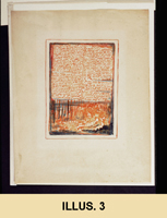
example, plate 4 of The Book of Urizen copy G is approximately 6 x 4 inches, but was printed on a
sheet 11.5 x 9 inches (illus. 3).
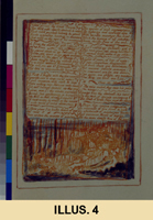
Rather than photographing the full sheet,
we cropped to the image, leaving just enough room on the 4 x 5 inch film
for the color bars and gray scale (illus.
4). Admittedly, cropping discards bibliographical information, such, as
in this case, the plate’s poor registration to the sheet, and thus fails
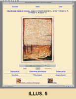
to represent the artifact itself. Consequently, like print reproductions and
facsimiles, our digital images (illus.
5) also hide poor registrations, but our reasons for cropping are more
technical and pedagogical than economic and aesthetic.
Recording the image on the film as large
as possible reduces the scaling ratio between reproductive source and original,
which ensures greater accuracy in the digital image (see below); cropping out the image’s margins
significantly reduces file size, and, for most images, enables the image to be
shown within the Archive’s interface on monitors 17” or larger
without scrolling. For us, cropping at this initial stage of photography is
determined by the material constraints of the electronic medium—by file
sizes, monitor size, screen resolutions, and band width.
Until May of 1998, we scanned our transparencies at IATH on a Microtek
Scanmaker III, a flatbed scanner with a transparent media adapter. Since
then,
we have scanned them at UNC on a Microtek Scanmaker V, which, instead of
the adapter built into the lid, uses a separate drawer to hold 4 x 5-inch
film
inside the scanner's body, where it is scanned using Microtek's EDIT (Emulsion
Direct Imaging Technology) system. Scanning transparencies directly and
not
through glass creates a sharper scan (one less layer to absorb light), eliminates
Newton rings (interference patterns resulting from the contact of film and
glass), and reduces dust. Slides (which have only rarely been used in the
Archive) are scanned on either a Nikon LS-3510AF Slide Scanner or a Microtek
35t Plus Scanner.
The
baseline standard for all scanned images to date is 24-bit color and a
resolution of 300 dots per inch (dpi). Depending on the size of the original,
the scanned image is scaled against the source dimensions of the original
artifact at 1:1, 1:2/3, or 1:1/2. We have found that these settings produce
excellent enlargements and suitably sized inline images. Nonetheless, we have
begun to scan at 600-dpi now that our hardware (the Macintosh G3 is equipped
with 384 MB of RAM and 9 GB of internal storage and another 5 GB external) can
better accommodate the larger file sizes that result, and we have also changed
the type of image file we color-correct. Initially, we saved our raw 300-dpi
scans as TIFFs and as JPEGs, storing the TIFFs (Tagged Image File Format) on
8mm magnetic Exabyte tape—data which we have since migrated to CD-ROM (in
Mac/ISO 9660 hybrid format). Now, by scanning at 600-dpi, we capture more
information, including paper tone and texture, but the resulting files are
quite large—artifacts a mere 8.5 x 6.5 inches produce files in excess of
100 MB. Consequently, we store these raw scans on CD-ROM as (LZW-compressed)
TIFFs, which cuts the file size in half. From the original 600-dpi TIFF image,
we also derive a 300-dpi (compressed) TIFF, which significantly reduces the
file size with no noticeable loss of information. Even so, like its parent
image, the 300-dpi TIFF is saved on CD-ROM and stored outside the Archive
proper.
The
color-corrected images that we
display to our users in the online Archive are all served using the JPEG (Joint
Photographic Experts Group, ISO/IEC 10918) format. A 300-dpi JPEG is derived as
the final step of the color-correction process and sent by electronic file
transfer from UNC to the Archive’s server at Virginia, where an assistant
logs its arrival on our internal tracking sheets (this 300-dpi JPEG becomes the
“enlargement” we offer
of each image and which on most systems takes a few seconds longer to load for
viewing). The assistant then derives a100-dpi JPEG (which will become the inline image, i.e., the image in our
Object View Page) from the color-corrected 300-dpi JPEG using ImageMagick,
software that enables the batch processing of image files from the UNIX command
line. Users are thus presented with an inline image at 100-dpi, which is fine
enough for most purposes and requires graphics files of modest size that
facilitate downloading and movement from image to image. And they have the
option to view an enlargement at 300-dpi for the study of details.
Scanned
images less than 9.5 x 7 inches—which includes all the illuminated
works—are scaled at 1:1 so the inline image will display at true-size on
a monitor with a 100-dpi screen-resolution. Its enlargement will be
approximately three times the original. Images between 9.5 x 7 and 16 x 12
inches are scaled at 1:1 to produce enlargements three times the original, but
the inline images are resized manually so that they can be viewed in their
entirety without scrolling; users wishing to see it at true size can increase
its size manually till it matches the measurements of the original, which are
given under the image. Images larger than 16 x 12 inches are scaled at 1:2/3 to
produce enlargements two times the size of the original, and images larger than
24 x 30 inches are scaled at 1:1/2 to produce enlargements one and a half times
the original, and the inline images in both categories are resized manually.
Though only two times or less the originals, on screen these enlargements
provide enormous amounts of detail.
As
part of the scanning process for each image, a project assistant completes a
form known as an Image Production (IP) record. The IP records contain detailed
technical data about the creation of the digital file for each image, including
owner institution, film stock, type, generation, and date made, measurements of
original image, reproductive source, and output, the scaling ratio, file size,
and scanner hardware and software. These records, retained in hard copy at the
project’s office, become part of the Image Information record that is
inserted into each image as metadata . Each and every image in the Archive also
contains textual metadata comprising its Image Information record (see below).
The
300-dpi (compressed) TIFF images generated by the scans are each individually
color-corrected against the original transparency or slide while it is on a
color-corrected light box (the
same one used in the photo shoots sponsored by the Archive). As noted, the
fidelity of the transparencies can be trusted, having themselves been verified
for color accuracy against the original artifacts. We correct the image using
Adobe Photoshop and calibrated, hooded Radius PressView 17SR and 21SR monitors.
We now color-correct the TIFF instead of JPEG because the lossless compression
does not discard image data each time changes are made to the file in
Photoshop. This 300-dpi (compressed) color-corrected TIFF is then saved on
CD-ROM. The color-correction process, which takes upwards of thirty
minutes—and sometimes as long as several hours—for each of the
Archive’s 3000 images is necessary to bring the color channels of the
digital image into alignment with the hues and color tones of the original
artifact. This is a key step in establishing the scholarly integrity of the
Archive because, although we cannot control the color settings on an individual
user’s monitor, the color-correction process ensures that each image will
match the original artifact when displayed under optimal conditions (which we
specify to users).
Images need to be “color- corrected” because the very
process by which they are digitized results in a loss of color quality.
Color correcting
compensates for this loss by changing an image’s shadows, midtones,
and /or highlights, hue, and saturation so that the colors of the final
output,
whether print or screen, conforms to the original—or original idea
of the graphic artist. Color correcting images is a form of editing, and
as such
is work requiring decisions best made by an editor and not scanning assistants.
Our aim is accuracy, to make reproductions appear as close as possible to
what they reproduce, but the means of doing so may seem overly subjective,
of requiring too much human intervention. To assume that machines—camera
and scanner—yield more objective results of and by themselves, however,
is mistaken. At the very least, the color cast created by the scanning
process
(true of even high-end drum scanners used by fine-art printers) must be removed
and the image sharpened with “unsharp mask.” [10] Most likely it will need more work, though
only a handful of Photoshop’s numerous features, such as curves,
levels, unsharp mask, color balance, and hue and saturation, will be
employed. But
one also needs to master the temptation to “improve” the original
aesthetically—eliminate foxing and other blemishes, for example, or
increase or decrease the saturation of certain colors—“restore”
it—bring a two hundred year old faded wash drawing to its presumed
original pristine condition. While absolute accuracy is not possible—not even
for Photoshop—the electronic medium combined with the skills and good
eyes of an editor can create trustworthy reproductions.
But
good eyes and skill in Photoshop will be for naught if the quality of the
reproductive source is compromised. As noted, we prefer to use 4 x 5 inch
transparencies instead of 35mm slides, in part because the former comes with color
bars and gray scales, has a smaller scaling ratio, and is what photographers
working for museums and libraries routinely provide for color reproductions.
Slides, on the other hand, while technically transparencies, are not meant for
publication. Indeed, all the institutions we deal with prohibit their
reproduction and make them for study, or, more exactly, reference purposes
only. A similar situation between high fidelity and reference exist in digital
reproduction. Many images of art
works on the Web today are from slides scanned at 72-dpi; these can give a
sense of composition or design, but cannot be used for scholarly and editorial
work, no more than Dover reproductions can (see below). Images from slides, even when scanned
at very high resolutions—which results in files of enormous
size—cannot match the quality of images scanned from transparencies
because they have a far lesser amount of photonic data.
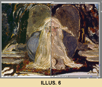
A comparison between a transparency and a slide, both scanned at 300-dpi,
scaled at 1:1 to the original, and shown at 100%, the size of our enlargements,
is most revealing. In a bit of “fearful symmetry,” the title plate
to Blake’s The Book of Urizen copy C is here reconstructed
with a left side from a transparency and a right from a slide (illus.
6). The transparency captures the texture of the paint and subtle gradations,
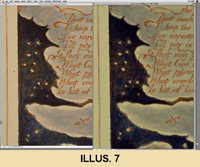
missing in the slide. The two versions of Blake’s America, a Prophecy
copy O plate 13 are even more telling, because here transparency (left) and
slide (right) are uncorrected raw scans. The transparency comes in sharper
and with more information, requiring less manipulation than the slide (illus.
7).
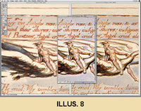
The difference between the two remains
as pronounced after they have been color corrected and sharpened (illus.
8), though both are far superior to the middle image, which is from
a slide scanned at 72-dpi but enlarged 400% to provide detail analogous
to the
two 300-dpi scans. Unlike them, however, it badly pixelates at this size
and distorts its information. [11]
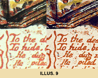
Trying to coax detail out of a 72-dpi scan is like using a magnifying
glass to examine a photomechanical reproduction, which, in place of pixels,
yields the interfering dots of the photographic screen (illus.
9).
Unless one examined originals with slide
loops (small but powerful magnifying glasses for 35mm slides placed directly
on the artifact and thus unacceptable to curators and librarians) or conventional
magnifying glasses, one had no choice but to resort to reproductions and facsimiles
for detail. The original Blake Trust facsimiles, produced through a combination
of collotype and hand-painting through stencils, have no screen, but, when
magnified, do reveal visual "boundaries" between colors (the result
of using stencils). Indeed, the Archive’s images have achieved greater
color fidelity in some notable instances—for example, several plates
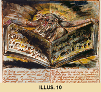
in the Blake Trust's facsimile of The Book of Urizen, copy G (left) have a reddish hue not found
in the originals. In this respect, the images in the Archive (right) are truer
to the tonality of the originals (illus.
10).
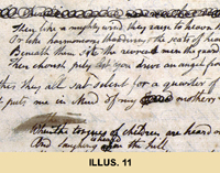
Our 300-dpi (JPEG) enlargement yields superb detail for close inspection
of printing and coloring, enabling one to study paint layers, differentiate
what was printed from plates and what added to impressions, examine emendations
in manuscripts (illus.11)
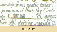
and the tiny hieroglyphic like figures and decorations between lines of text
(illus. 12).
They provide the raw data for editing, enabling
one to compare multiple versions of texts and take on those most puzzling
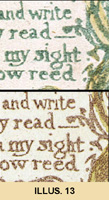
of all marks, the ones simultaneously part of the text and design. For example,
in plate 4 (lines 13-16) of Songs of Innocence and of Experience (illus.
13), is the mark after “write” punctuation (comma or
fat period) or tendril—or both?
 |
After “sight” and “reed,”
Erdman records a colon and a period, though the latter is more oblong than
the former. In copy F (top), Blake colored the tendril yellow but left the
tip green in the shape of a period, forming a colon after the fact. A happy
accident? More challenging are
designs 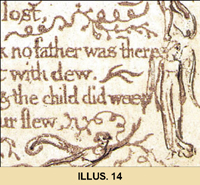 like that of plate 13 of Songs (illus.14)
which force one to ask if figures or parts of them can function as stops,
whether non-linguistic marks belong to the linguistic code.
Enlargements of good digital images can yield more information than
the originals, as can enhancements, which can reveal such subtleties as
a
black-inked signature faded into a black wash, or, when creatively “deformed,”
as demonstrated by Jerome McGann, yield hidden structural information. [12] Often as important as enlargement is
comparison; in the Archive one can, with almost all the illuminated books,
immediately
check an image in one copy against other copies of that book, which has never
been possible with the printed record and rarely in any one real collection.
Reproducing
images more accurately than print, images not in print, and multiple copies of
images, makes the Archive the first place to stop when studying Blake. The
Archive’s scholarly integrity, however, also requires that its images be
true size, because scale
can be a significant aspect of the experience and meaning of an object. We grant structural priority to the
physical object by accounting archivally and editorially for the original size
of Blake's works, whether plates, paintings, drawings, manuscripts, or printed
pages. We have done that in two
ways, by displaying the actual size of every object directly beneath it, and by
providing ImageSizer, a sophisticated image manipulation tool, available from
every Object-View Page. A new Java applet developed at IATH with the Blake
project in mind, ImageSizer can resize images on the fly at the size of
originals on monitors whatever their resolution. It is this feature in the
Archive that makes our images digital “facsimiles.”
ImageSizer’s principle function for the Archive is to allow users
to view Blake’s work on their computer screens at its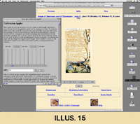 actual physical
dimensions. Users may invoke the ImageSizer’s calibration applet to
set a “cookie” informing the ImageSizer of their own unique screen-resolution
(illus. 15).
Users hold an actual ruler up against the one on the screen
and use the slider bar to align the measurements of both. Screen resolution
thus determined, the applet automatically resizes the images (which have already
been scaled to display at true size on a 100-dpi screen) to appear at true
size on the user’s monitor. Based on this data (recorded in the cookie),
all subsequently viewed images will be resized on the fly so as to appear
at their true size on the user’s screen. If a user returns to the Archive
at some later date from the same machine (and the resolution has not been
changed), the data stored by the cookie will remain intact, and there will
be no need to recalibrate. Users may also set the ImageSizer’s calibration
applet to deliver images sized at consistent proportions other than true size,
for example, at twice normal size (for the study of details). 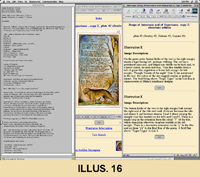 In addition,
the ImageSizer allows users to enlarge or reduce the image within its on-screen
display area, and to view the textual metadata comprising the Image Information record
embedded in each digital image file (illus.
16).
The
Image Information record combines the technical data collected during the
scanning process from the Image Production record with additional bibliographic
documentation of the image, as well as information pertaining to provenance,
present location, and the contact information for the owning institution. These textual records are, at the most
literal level, a part of the Archive's image files. Image files are typically considered to be nothing but
information about the images themselves (the composition of their pixelated
bitmaps, essentially); but in practice, an image file can be the container for
several different kinds of information. The Blake Archive takes advantage of this
by slotting its Image Information records into that portion of the image file
reserved for textual metadata.
Because the textual content of the Image Information record now becomes
a part of the image file itself in such an intimate way, this has the great
advantage of allowing the record to travel with the image, even if it is
downloaded and detached from the Archive's infrastructure. The Image Information record may be
viewed using either the “Info” button located on the control panel
of the Archive’s ImageSizer applet or with the Text Display feature of
standard software such as Adobe Photoshop or X-View.
Also from the Object View Page, a user can evoke Inote, the Archive’s
other Java applet. Inote is an image-annotation tool which permits us to
append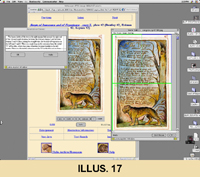 textual notes (“annotations”) to selected regions (or “details”)
of a particular image; these annotations are generated directly from the
SGML-encoded
illustration descriptions prepared by the editors. Inote functions most powerfully
when used in conjunction with the Archive’s image searching capabilities,
where it can open an image found by the
search engine, zoomed to the quadrant of the image containing the object(s)
of the search query, with the relevant
textual annotation displayed in a separate window (illus.
17). From there, Inote allows the user to enlarge the image for further
study and/or to access additional annotations located in other regions of
the image. Inote may also be invoked directly from any of the Archive’s
Object View pages, allowing users to “browse” the annotations
created for a given image.
III.
Conclusion
Blake’s
illuminated works are widely dispersed and more and more severely restricted as
a result of their value, rarity, and fragility. Studying them, at both the
introductory and advanced levels, requires accurate reproductions of as many
copies of each book as is possible. One might wish to argue that translating
Blake’s analogue hand into the discreet digits of types for the purpose
of publication merely recreates the relation between manuscript (fair copy) and
letterpress, and hence appropriate for texts from the period. Such an argument,
though, would not only ignore Blake’s intentions, but it would also
dismiss as meaningless the historical, technical, and aesthetic information
provided by the poem’s form. Though not reproducible in the digital
technology of his day, and unevenly so by the dots per inch that followed,
Blake’s pictorial poetry can be accurately reproduced in today’s
digital technology when imaging protocols such as those outlined here are
followed. For most scholarly purposes, the resulting reproductions will more
than suffice, or, at the very least, adequately prepare one for examining
originals, those not reproduced in the Archive and those for which bibliographic
information necessarily requires handling the artifact.
The
Archive’s exceptionally high standards of site construction, digital
reproduction, and electronic editing have made possible reproductions that are
more accurate in color, detail, and scale than the finest commercially
published reproductions and facsimiles, and texts that are more faithful to
Blake’s own than any collected edition has provided. We have applied equally high standards
in supplying a wealth of contextual information, which includes full and
accurate bibliographical details and meticulous descriptions of the content of
each image. Finally, users of the
Archive can attain a new degree of access to these works through the combination
of powerful text-searching and (for the first time in any medium) advanced
image-searching tools that are made possible by the editors’ detailed
image descriptions and innovative software.
We
are hoping, of course, that the Archive, once extended to encompass the full
range of Blake’s work, will ultimately set a new standard of
accessibility to a vast collection of visual and textual materials that are
central to an adequate grasp of the art and literature of the eighteenth and
nineteenth centuries. But we have
also come to see the Blake project as a pacesetting instance of a fundamental
shift in the ideas of “archive,” “catalogue,” and
“edition” as both processes and products. Though
"edition" and "archive" are the terms we have fallen back
on, in fact we have envisioned a unique resource unlike any other currently
available—a hybrid all-in-one edition, catalogue, database, and set of
scholarly tools capable of taking full advantage of the opportunities offered
by new information technology.
1. “The Tyger,” Songs of Innocence and of Experience copy C.
2. “The Tyger,” Songs of Innocence and of Experience copy Z.
3. The Book of Urizen copy G, plate 4, full sheet.
4. The Book of Urizen copy G, plate 4, uncorrected transparency with color bars and gray scale.
5. The Book of Urizen copy G, plate 4, corrected in Archive’s Object-View Page.
6. The First Book of Urizen copy C, title plate,reconstructed from transparency (left) and slide (right) scanned at 300-dpi, detail.
7. America, a Prophecy copy O plate 13, uncorrected transparency (left) and slide (right) scanned at 300-dpi, detail.
8. America, a Prophecy copy O plate 13, uncorrected transparency (left) and slide (right) scanned at 300-dpi, with image from slide scanned at 72-dpi (middle), detail.
9. The Book of Urizen copy G, plate 5, photographic screen of Dover Publication reproduction (left) and Archive digital image (right), detail.
10. The Book of Urizen copy G, plate 5, collotype and stencilled coloring of Blake Trust Facsimile (left) and Archive digital image (right), detail.
11. Island in the Moon manuscript, page 14 , detail.
12. Marriage of Heaven and Hell copy D, plate 11, hieroglyphic-like figures between lines 13 and 15, detail.
13. Songs of Innocence and of Experience copies C (bottom) and F (top), plate 4, lines 13-16, detail.
14. Songs of Innocence and of Experience copy C, plate 13, lines 5-8, detail.
15. ImageSizer’s calibration applet setting a “cookie” informing the ImageSizer of user’s own unique screen-resolution.
16. Textual metadata comprising the Image Information record embedded in each digital image file.
17. Inote used in conjunction with the Archive’s image searching capabilities, where it can open an image found by the search engine, zoomed to the quadrant of the image containing the object(s) of the search query, with the relevant textual annotation displayed in a separate window.
